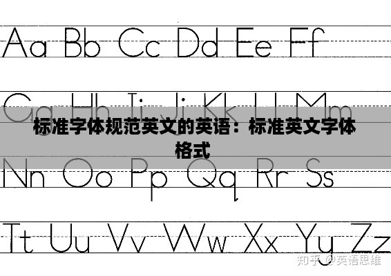
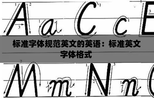
Introduction to Standard Font Specifications in English
Standard font specifications in English are crucial for maintaining consistency and readability across various written materials. Fonts are not just visual elements but also play a significant role in conveying the tone and professionalism of a document. In this article, we will explore the importance of standard font specifications, the types of fonts commonly used, and the best practices for selecting and using fonts in English documents.
The Importance of Standard Font Specifications
Standard font specifications ensure that documents are easily readable and accessible to a wide audience. Consistent use of fonts across different documents from the same source enhances brand recognition and professionalism. Additionally, standard fonts are often optimized for screen readability, which is especially important in the digital age where most content is consumed online.
Commonly Used Standard Fonts in English
Several fonts have become standard in English typography due to their readability, versatility, and widespread support. Here are some of the most commonly used standard fonts:
Times New Roman: A serif font known for its readability and classic look, often used in academic and business documents.
Arial: A sans-serif font that is clear and easy to read, making it a popular choice for both print and digital media.
Calibri: The default font in Microsoft Office applications, Calibri is designed for readability on screens and in print.
Georgia: A serif font similar to Times New Roman but with a more modern design, often used for web content.
Verdana: A sans-serif font known for its wide letter spacing, making it particularly easy to read on computer screens.
Choosing the Right Font
Selecting the right font is essential for effective communication. Here are some factors to consider when choosing a font for English documents:
Context: The purpose of the document should guide the font choice. For formal documents, serif fonts like Times New Roman or Georgia are often preferred, while sans-serif fonts like Arial or Calibri may be more suitable for casual or modern content.
Readability: The font should be easy to read, with clear letterforms and sufficient spacing. Avoid fonts with overly decorative or stylized characters unless the design calls for a more artistic approach.
Compatibility: Ensure that the font is widely available and compatible with the platforms where the document will be viewed or printed.
Consistency: Stick to one or two fonts throughout the document to maintain a cohesive look and feel.
Best Practices for Using Standard Fonts
When using standard fonts in English documents, it's important to follow best practices to ensure clarity and professionalism:
Font Size: Choose a font size that is comfortable to read. For body text, a size between 10 and 12 points is generally recommended.
Line Spacing: Adequate line spacing improves readability. A line spacing of 1.5 or double is often used for body text.
Capitalization: Use proper capitalization rules to maintain clarity. Avoid all caps unless necessary for emphasis.
Headings and Subheadings: Use different font styles or sizes for headings and subheadings to create a clear hierarchy and structure.
Consistency Across Documents: Maintain consistency in font choice and formatting across all documents produced by the same organization or individual.
Conclusion
Standard font specifications are a vital aspect of effective communication in English. By understanding the importance of font choice, the types of fonts commonly used, and best practices for their application, individuals and organizations can create documents that are both visually appealing and easy to read. Whether for academic, business, or personal use, adhering to standard font specifications can enhance the overall quality and impact of written materials.
转载请注明来自山东高考日语培训,日本留学,枣庄日语培训机构,本文标题:《标准字体规范英文的英语:标准英文字体格式 》


 蜀ICP备2022005971号-1
还没有评论,来说两句吧...